
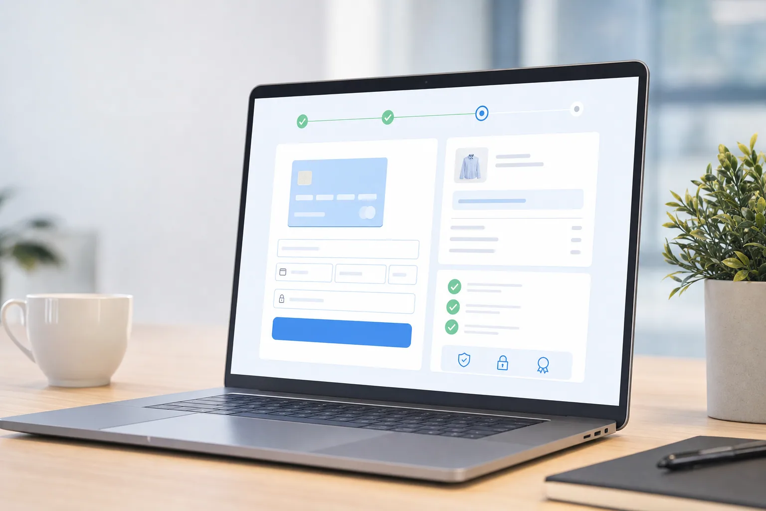
Your checkout page is where money lives or dies for DTC brands. A single form field too many, a confusing trust signal placement, or a slow page load can cost you thousands of dollars in abandoned carts every week. Yet most eCommerce teams treat checkout optimization like an afterthought, focusing instead on driving more traffic while hemorrhaging conversions on the page that matters most.
Checkout optimization is not about making your page prettier. It is about removing friction at every step so that customers who are ready to buy can complete the transaction without hesitation. The brands winning at this are not redesigning their checkout pages every quarter. They are methodically testing small changes, measuring impact in real time, and scaling what works.
Here is what separates high-converting checkout experiences from the rest.
Start with a Friction Audit
Before you test anything, you need to know what is actually slowing customers down. Most brands guess. They think their form is too long, or their button color is wrong, when the real problem might be that their trust signals are buried, their page loads in four seconds instead of one, or their payment options are too limited.
Spend a week observing your checkout flow the way your customers see it:
- Load your checkout on mobile and desktop using a 4G connection (not your office WiFi).
- Count every required form field. Every additional field increases abandonment.
- Check where you display trust badges, guarantees, and security seals. Are they visible above the fold?
- Test payment method availability. Do you offer the options your customers actually use?
- Measure page load time using Google PageSpeed Insights. Every second matters.
- Watch session recordings of real users going through checkout. Where do they hesitate or bounce?
This audit reveals your biggest friction points before you spend time and budget on fixes that might not move the needle.
Reducing Cart Abandonment Through Form Design
Your form is the core of checkout optimization. Most brands make it harder than it needs to be.
The simplest leverage point is form length. Every additional field you require drops conversion by 1 to 5 percent on average. The math is brutal. If you are collecting data you do not immediately need, you are losing money.
Ask yourself: do you need the customer's phone number to process their order? Do you need their company name? If the answer is no, remove it. You can always email them later to ask for optional information.
Second, autofill is your friend. Enable address autocomplete for shipping. Let customers authenticate with their Apple or Google account instead of creating a new password. If someone is already logged in, do not ask them to re-enter information you already have.
Third, mobile checkout is where most DTC abandonment happens because most people browse on their phones. Test your checkout on a real mobile device, not in your browser's mobile view. Fields that feel simple on desktop become tedious on a small screen.
Finally, show your shipping cost before the customer enters payment information. Surprise shipping costs at the final step are a common abandonment trigger. Be transparent early.
Building Trust at the Point of Sale
Checkout is where skepticism peaks. Your customer is about to give you their credit card number. They need to know they are safe and making the right decision.
Place trust signals where they matter most: near the payment field and above your submit button. This includes:
- Security badges from Trustwave, McAfee, or your payment processor.
- Money-back guarantees or return policies stated clearly.
- Customer testimonials or recent purchase notifications.
- SSL certificate verification (showing a lock icon and your security statement).
Brand logos and press mentions also work, but only if they are legitimate. A fake badge erodes trust faster than no badge at all.
One overlooked trust lever is offering multiple payment options. Customers who see their preferred method available (Apple Pay, Google Pay, PayPal, Stripe, Afterpay) are more likely to convert. Each option reduces friction for a different audience.
Testing Page Speed and Load Performance
A one-second delay in page load time costs you customers. Slower pages see higher abandonment, period. This is not negotiable.
Optimize for speed by:
- Compressing images so they load fast without looking pixelated.
- Using a content delivery network (CDN) to serve assets from servers close to your users.
- Minimizing JavaScript that runs before your checkout form appears.
- Deferring non-critical third-party scripts (analytics, chat widgets) until after the page loads.
- Testing on real mobile networks, not just desktop broadband.
Tools like Google PageSpeed Insights and WebPageTest show you exactly where slowdowns happen. Fix the biggest bottleneck first, measure the impact, then move to the next one.
Iterating Checkout Changes with Data
Checkout optimization works best when you test systematically and kill losing changes inside 48 hours.
This means running actual A/B tests, not guessing. When you change your form fields, button color, or copy, measure the impact on conversion rate and average order value. Some changes help. Others hurt. Data tells you which is which.
Start with high-impact tests:
- Single-page vs. multi-step checkout.
- Required vs. optional account creation.
- Shipping cost display timing.
- Button text ("Complete Purchase" vs. "Pay Now" vs. "Place Order").
- Trust signal placement and messaging.
Run each test for at least one week to gather enough data. If a test shows a clear winner, ship it. If the result is unclear, keep the old version and move to the next test.
The brands winning at this do not overthink individual changes. They run quick tests in parallel, measure ruthlessly, and scale what works. Most agencies run checkout tests in sequence, waiting weeks between changes. That is waterfall thinking. Real optimization happens when you test faster.
Moving Forward
Checkout optimization is not a one-time project. It is an ongoing process of removing friction, testing improvements, and measuring results. The brands that see the biggest gains treat checkout like the revenue engine it is, not an afterthought.
Start by auditing your current checkout for friction points. Then run one focused test. Measure the result. Keep what works. Repeat. Over time, small improvements compound into dramatically higher conversion rates and lower cart abandonment.
The opportunity is sitting on your page right now. Your customers are ready to buy. The only question is whether your checkout is fast enough, clear enough, and trustworthy enough to let them.